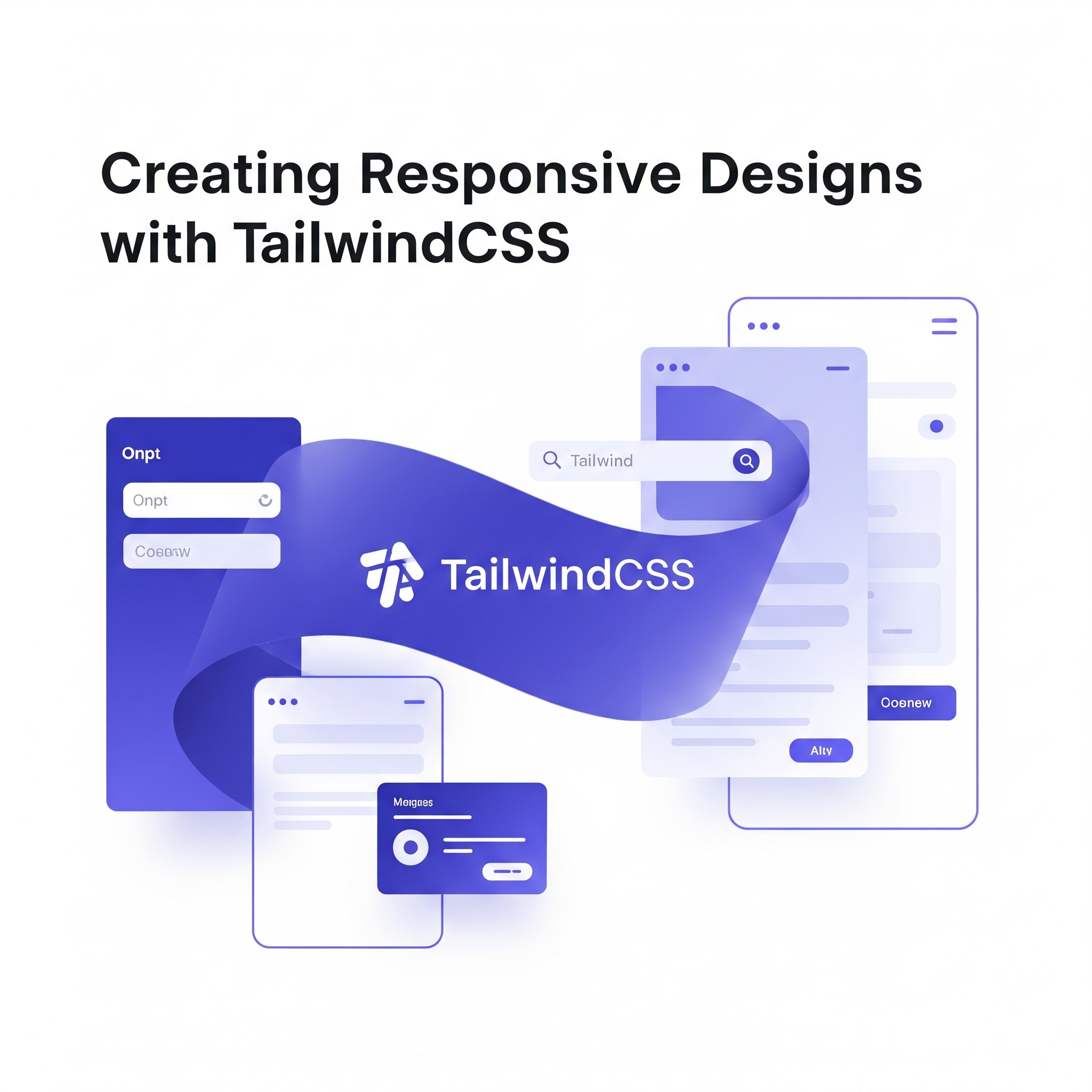
Creating Responsive Designs with Tailwind CSS
Responsive design is no longer optional in modern web development. With Tailwind CSS, creating responsive layouts becomes intuitive and efficient. Let's explore how to master responsive design with this powerful utility-first framework.
Mobile-First Approach
Tailwind CSS follows a mobile-first approach, meaning styles are applied to mobile devices by default, and larger screens are targeted using responsive prefixes.
<div class="w-full md:w-1/2 lg:w-1/3 xl:w-1/4">
  <!-- This div is full width on mobile, half on medium screens,
       one-third on large screens, and one-fourth on extra large screens -->
</div>
Breakpoint System
Tailwind's breakpoint system is designed to be intuitive and flexible:
- •sm: 640px and up
- •md: 768px and up
- •lg: 1024px and up
- •xl: 1280px and up
- •2xl: 1536px and up
Responsive Typography
Typography should scale appropriately across different screen sizes:
<h1 class="text-2xl md:text-4xl lg:text-6xl font-bold">
  Responsive Heading
</h1>

<p class="text-sm md:text-base lg:text-lg leading-relaxed">
  This paragraph adjusts its size and line height across breakpoints.
</p>
Flexible Grid Systems
Create responsive grids that adapt to different screen sizes:
<div class="grid grid-cols-1 md:grid-cols-2 lg:grid-cols-3 xl:grid-cols-4 gap-4">
  <div class="bg-gray-200 p-4">Item 1</div>
  <div class="bg-gray-200 p-4">Item 2</div>
  <div class="bg-gray-200 p-4">Item 3</div>
  <div class="bg-gray-200 p-4">Item 4</div>
</div>
Responsive Spacing
Adjust padding and margins for different screen sizes:
<div class="p-4 md:p-8 lg:p-12">
  <div class="mb-4 md:mb-8 lg:mb-12">
    Content with responsive spacing
  </div>
</div>
Advanced Responsive Patterns
Container Queries (Coming Soon)
While not yet available in Tailwind CSS, container queries will revolutionize responsive design by allowing components to respond to their container size rather than viewport size.
Responsive Images
Combine Tailwind with modern image techniques:
<img
  class="w-full h-48 md:h-64 lg:h-80 object-cover rounded-lg"
  src="image.jpg"
  alt="Responsive image"
/>
Responsive Navigation
Create navigation that adapts to different screen sizes:
<nav class="flex flex-col md:flex-row items-center justify-between p-4">
  <div class="mb-4 md:mb-0">
    <img src="logo.svg" alt="Logo" class="h-8">
  </div>
  <div class="flex flex-col md:flex-row space-y-2 md:space-y-0 md:space-x-4">
    <a href="#" class="hover:text-blue-500">Home</a>
    <a href="#" class="hover:text-blue-500">About</a>
    <a href="#" class="hover:text-blue-500">Contact</a>
  </div>
</nav>
Performance Considerations
Purging Unused CSS
Tailwind's purge feature removes unused styles in production:
// tailwind.config.js
module.exports = {
  content: [
    './pages/**/*.{js,ts,jsx,tsx}',
    './components/**/*.{js,ts,jsx,tsx}',
  ],
  // ... other config
}
JIT Mode
Just-In-Time mode generates styles on-demand, reducing build times and file sizes.
Best Practices
- •Start Mobile-First: Always design for mobile devices first
- •Use Consistent Breakpoints: Stick to Tailwind's default breakpoints
- •Test Across Devices: Regularly test your designs on various screen sizes
- •Optimize Images: Use responsive images and modern formats
- •Consider Touch Targets: Ensure interactive elements are large enough for touch
Conclusion
Tailwind CSS makes responsive design approachable and maintainable. By following mobile-first principles and leveraging Tailwind's responsive utilities, you can create beautiful, functional designs that work across all devices.
The key is to think in terms of progressive enhancement – start with a solid mobile foundation and enhance the experience for larger screens.